Experiential Design
Engineering and design are converging. The latest technological developments in digital design tools have given web designers the space to be more creative and the courage to break a good few rules. As a result, design trends are coming closer to one of the main principles of contemporary art — the importance of providing a unique experience.
The avant-garde is back. Expect brutal experimental approaches.
Trends do not develop out of nowhere. Sometimes they are driven by technology and often they are recycled versions of older ones. To understand new approaches to web design, it’s useful to go back to the avant-garde, an artistic movement that sought to experiment with form. By pushing the boundaries of the aesthetic norm while questioning the status quo, the movement achieved innovation, dramatically changing the experience of art for spectators.
Take one of the most influential artists of the 20th century, Pablo Picasso. His exploration of Cubism broke away from traditional painting techniques, played with asymmetry, and juxtaposed geometric shapes with elements of collage.

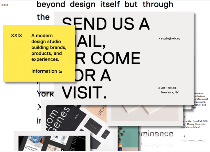
The comparison might seem far-fetched but the principles behind current trends are actually quite similar: broken grids, juxtaposition and overlapping of elements in collage-style, vibrant colours in unusual combinations, asymmetrical geometric shapes, expressive serif typography, and a preference for illustrations rather than the realistic depictions of photography.
The most radical and disruptive approaches are brutalism and maximalism — that is, an overabundance of components in hyper-pastiche style. Both deviate from traditional design concepts and are highly influenced by hipster retro aesthetics.
Trends are not always there to be followed but to push forward experimentation. Some of these, like maximalism, definitely jeopardise universal design principals, i.e., accessibility for all abilities, which is why minimalist sites that favour a clean approach to user interface (UI) and user experience (UX) will always remain relevant. Nonetheless, some of these more disruptive tendencies will come to dominate the arty web design landscape.
The influence of mobile and video
In terms of UI, the hamburger menu used by mobile apps is fast becoming a common feature for desktop sites. Equally, main navigation items focus on the products or services offered, allowing for easy, one-click access. More generic sections such as “About” or “Contact” are relegated to secondary menus, usually in the footer. And forget about the “Home” button, it’s long gone now.
Some sites are steering towards having navigation elements scrolling from the bottom, emulating the experience of mobile UI. This synergy of app and web behaviours is called Progressive Web Apps, and it holds a wealth of possibility. The UX provided by fast mobile finger scrolling has evolved into animated web transitions and into using text as a moving image.
The impact of gif culture and visual apps such as Snapchat and Instagram continues, morphing into a hybrid feature known as cinemagraphs. These still photographs feature specific elements in repeated motion (creating the effect of a video clip), with some variations offering 360° views — the perfect vehicle for displaying products or interactive features that appear when touched, hovered over or clicked on.

Lightweight javascript animations are also becoming increasingly popular as backgrounds. In-built video replaces embedded YouTube or Vimeo clips, enabling more integrated and seamless multimedia storytelling experiences. These hyper-dynamic tactics are not merely aesthetic; they’re designed to enhance calls to action (CTAs) or promote a product, increasing engagement and conversion.
Micro-interactions are also having their moment. Popularised by Facebook, they allow users to express a reaction, thus interacting with content in real time and providing immediate insights into their activity. Importantly, these interactions do not break the communication cycle as they don’t require reloading a page, a crucial detail in mobile UX.
Illustration takes centre stage
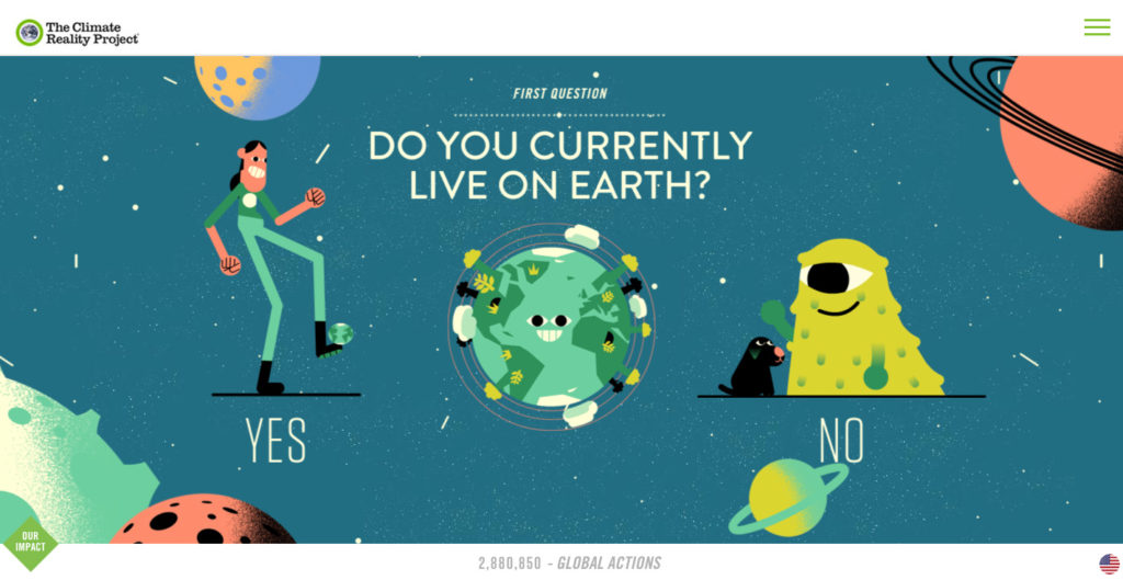
As advertising gravitates towards using real life subjects rather than models, and the industry takes steps to become more inclusive, illustration steps into the spotlight. Research carried out by Lloyds Banking Group found that only 47% of people feel accurately represented in ads, and illustration may hold the key. Webflow’s John Moore Williams uses Shopify’s new design system to explain how this can work:
“The human being illustrated in Shopify Polaris’ hero image is just a human being. Specifiers like race, gender, nationality, and much more are left undefined, making it easier for any of us to project ourselves into the role of that lone thinker, contemplating the creative possibilities illuminated by a guiding light.”
Illustrations can also be fully tailored to suit a brand’s tone, adding a more humane and approachable element to its identity.
All these new trends seek to provide hyper-dynamic, interactive experiences, drawing on surprising elements designed to capture attention.

That explains the increasing emphasis on UX copywriting within an overall content strategy when designing user experiences. UX copywriting not only provides valuable content for important touchpoints (helping users to achieve their goals), it also embodies a brand’s voice, and it’s becoming ever more relevant as chatbots become more sophisticated.
